The 2am Page: Designing Practical Info That Actually Gets Used
Travelers read the practical-info page exactly once — at 2am, jet-lagged, when something is wrong. Design for that single reading and the page does its job. Design for completeness and it does nothing.
The practical-info page of an itinerary is the page that gets read once. Not once a day; once, period. A traveler with a well-built itinerary flips past the practical-info page on first read, doesn't think about it, and then returns to it exactly one time — at 2am, jet-lagged, after something has gone wrong.
The page should be designed for that single reading. Not for the showcase moment, not for completeness, not to demonstrate how thoroughly the DMC has covered every contingency. For one person, one screen, one panicked minute, trying to find one phone number.
The 2am scenario, in detail
A traveler arrives in Dubrovnik on a connection from London. Their bag is at Heathrow. It's 23:30 when they land, they're past the airport transfer to the hotel, and at 02:00 they realize the front desk is closed and they need to reach someone — anyone — who can help with the bag. They haven't saved the DMC's number. They reach for the PDF on their phone.
In that scenario, they need exactly one thing: a phone number that connects to a human who can solve the problem. Every other piece of information on the page is noise.
The hierarchy
A working practical-info page has a single hierarchy:
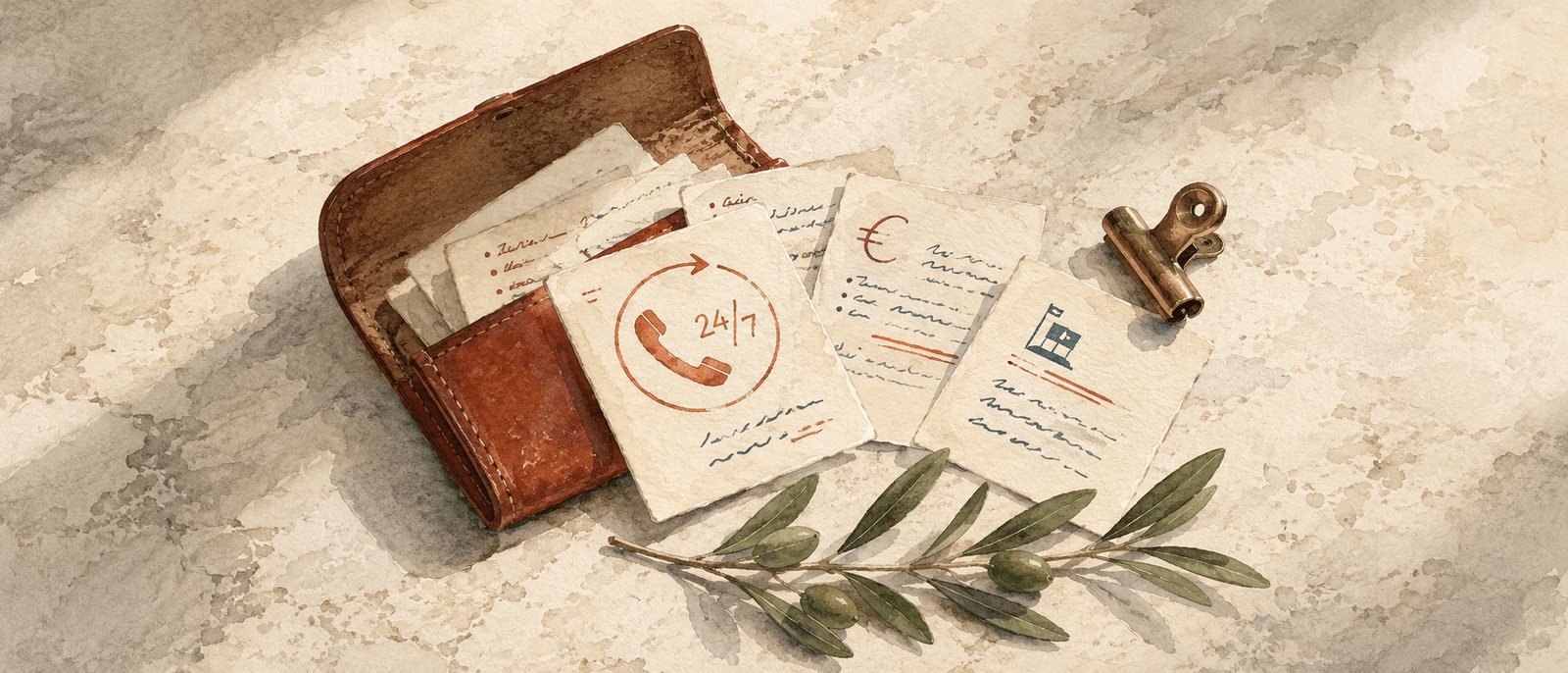
- 24/7 emergency line, rendered enormous. Larger than you'd think. 60–80pt, monospace, single line, no decoration. The biggest single piece of type on the page after the page title. The DMC's WhatsApp-able number. Not a generic agency line; the trip lead's direct line, or a dedicated 24/7 desk.
- Trip lead's name + direct number. Second-tier. Person, phone number, ideally a WhatsApp handle. Renders large but not enormous — the 24/7 line is the primary.
- Quick-glance rows for everything else. Currency, tipping norms, country emergency (112 in Croatia), nearest embassy. One row each, single-line phrases. No paragraphs.
That hierarchy is what makes the page work at 2am. The traveler's eye lands on the biggest thing. The biggest thing is the number they need to call. They don't have to read any of the smaller rows; those become useful in calmer moments.
What goes on the page
24/7 emergency line
Every premium itinerary needs one. Not optional. The number must:
- Be answered by a human, not a menu
- If your 24/7 line goes to an IVR, the page is lying. Premium DMCs answer their phones. If you can't, the page should be honest about it ('Text us — we'll call back within 20 minutes').
- Be WhatsApp-able if you're international
- Travelers without local SIMs use WhatsApp by default. A 24/7 line that only takes calls cuts you off from the most common channel.
- Be the same across every trip
- Not a per-trip burner number. A consistent number that the DMC and trip lead both can answer.
Trip lead direct line
Below the 24/7 line, sized down. The traveler in the 2am scenario probably tries the 24/7 line first; the trip lead's direct line is the fallback. Including a name with the number ("Goran — +385 91 …") makes the line feel like a person, not a desk.
Country emergency number
112 in Croatia (and the EU). One row, three digits. Travelers think they know the number ("isn't it 911?") and most of them are wrong. The row exists so the panic reaction has the right number in front of it.
Currency + tipping
Two short rows. Currency: "Euro (€)" — Croatia adopted the euro in 2023; older itineraries that still say "Kuna" are telling on themselves. Tipping: a single sentence — "10% in restaurants is generous; not expected at counter-service." Avoid the urge to write a paragraph. The traveler doesn't need it.
Nearest embassy / consulate
Optional but high-value for nationalities where the embassy isn't in the trip's primary city. For Croatia: the U.S. embassy is in Zagreb, the U.K. embassy is in Zagreb, the Australian embassy is in Athens. A traveler losing a passport on day 3 in Dubrovnik benefits from knowing this is a 400-kilometer issue, not a 4-kilometer issue.
One row for "what to do if you lose this document"
A small note that the document is also at a share URL, plus the URL. The traveler with a dead phone can pull up the same itinerary on the front desk's computer. Five words on the page, enormous value when needed.
What doesn't go on the page
- A 'visa requirements' paragraph
- By the time the traveler is in the country reading the itinerary, the visa question is settled. Pre-trip emails handled it. The practical-info page is for in-country use.
- Cultural-etiquette tips
- 'Croatians value punctuality' isn't useful at 2am. If etiquette guidance matters, weave it into the welcome note or specific block descriptions.
- A weather forecast
- Forecasts are obsolete by the time the document is read. Mention weather in the welcome note in general terms ('breezy afternoons in early October').
- A 'best photo spots' list
- Doesn't belong here. Belongs in block descriptions if it matters.
- A 'what to pack' list
- Pre-trip email territory. The traveler is already in the country.
- Restaurant recommendations beyond what's booked
- If the trip has dinner reservations, those are blocks. Adding 'other options' to the practical-info page conflicts with the curated experience the document is promising.
- Tour-operator boilerplate
- Liability terms, cancellation policies, deposit schedules. All belong on the booking agreement, not in the practical-info page.
The size hierarchy, concretely
On a premium-rendered page, the type sizes look roughly like this:
- Page eyebrow ('If anything at all, this is who to call.')
- Display serif, italic, ~24pt. The page's identifier, not its content.
- The 24/7 line
- Monospace, 60–80pt. The dominant element.
- Trip lead block
- Display serif name + monospace number, ~22pt name + ~18pt number.
- Quick-glance rows
- Mono labels at 10pt all-caps + body serif values at ~14pt.
- Footer note
- Body serif italic, ~12pt. The 'lose this document' line.
That hierarchy is roughly 8:1 from the largest (24/7 line) to the smallest (footer). Premium documents aren't afraid of hierarchy — they use it deliberately. The flat-hierarchy alternative (everything in 14pt sans-serif) reads as a form, not as a hospitable page.
The page eyebrow line
The page's identifier — what would be a section heading on most pages — works best as a one-line italic phrase rather than a literal label. "Practical info" is what every other DMC writes. The premium version says something like:
"If anything at all, this is who to call."
Or:
"In case of anything: us first, before anyone else."
The phrasing matters more than you'd think. It tells the traveler that the DMC's default position is to be the first call. That single positioning act — us first — is what separates the premium DMC from the booking agency. It costs nothing to write. It signals everything.
Sample copy that works
Here's a full practical-info page distilled to its content (without the rendered hierarchy):
If anything at all, this is who to call.
+385 91 123 4567 — 24 hours, WhatsApp or call.
Goran (your trip lead) — +385 91 234 5678 — direct.
Country emergency: 112 (works EU-wide, English speaking operator).
Currency: Euro (€). Cards work everywhere. ATMs are plentiful in tourist areas — keep €100 cash for smaller island spots.
Tipping: 10% in restaurants is generous. Round up taxis. Tour guides typically €10–20 per day per group.
U.S. embassy: Zagreb (a 5h drive from Dubrovnik). For lost passports we'll arrange a local police report and a courier first — call us before you call the embassy.
If you lose this document, it's also at mydmc.app/trip/abc-123. The front desk can pull it up.
About 110 words of content. Rendered on the page at the right hierarchy, this single screen does everything a premium practical-info page needs to do. Most DMC practical-info pages run 400+ words and accomplish less.
The short version
Designed for one reading, at 2am, by a panicked person looking for one number. The 24/7 line dominates. Everything else is quick-glance rows. The eyebrow phrasing positions the DMC as the first call, not the booking agent. Cut anything the traveler doesn't need at 2am.
The page is one of the cheapest signal-of-care moves in the entire document. Most DMCs over-fill it. The premium move is restraint: the page that says less and shows more hierarchy is the page that actually gets used.