The Day-Intro Page: Pacing the Week
Between dense days of blocks, the day-intro page is the breather. Get the photo / breathing-room / type ratio right, and the document reads as editorial. Get it wrong, and you're back at corporate.
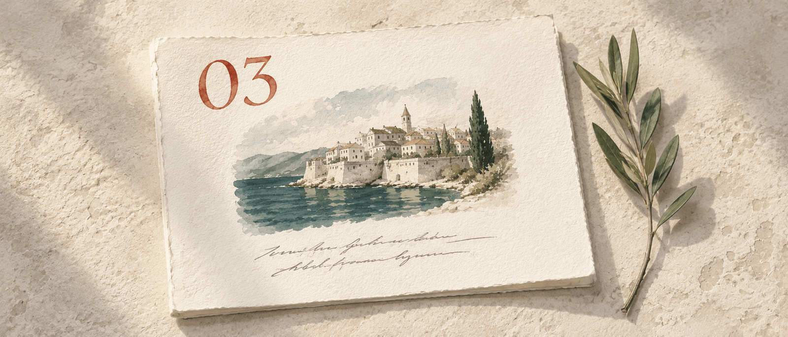
A seven-day itinerary has seven day-intro pages, each one starting a chapter. The page sits before that day's blocks, and its job is to slow the reader down. Not because slow is good — because the next page is dense (blocks, times, names, places), and an aerated breakpoint between dense pages keeps the document scannable.
The day-intro is also the surface where the document is most obviously editorial. If the cover sets the tone and the welcome note sets the voice, the day intros set the rhythm. They're the visual breath between the chapters.
The five elements
A working day-intro page is roughly five elements stacked vertically:
- Hero photo (top 60%). A 3:2 image filling most of the page. Specific to the day's location or theme — not a generic destination shot.
- Day numeral (large, accent color). '02' / '03' / '04' rendered display-tier in the accent color. The single biggest type element on the page after the title.
- Date + location label (mono, small). 'TUE 14 OCT · HVAR' in all-caps monospace. Sits below the numeral as a quiet anchor.
- Day title (display serif, italic accent on the last word). Five to nine words. A line that names the day's spine — 'A long lunch on _Vis_,' 'Slow morning, _harbour_ afternoon.' The italicized last word is the typographic accent.
- Pull-quote (italic body serif, optional). Two to four lines from a writer's voice. Anchored at the bottom of the page. Used on roughly half the days, never every day.
That's it. Five elements, four of them required, one optional. The page is intentionally sparse — the density comes on the page after.
The 60 / 30 / 10 ratio
The visual ratio of a working day-intro page is roughly:
- 60% photo
- Hero image dominates. The eye lands here first.
- 30% breathing room
- Negative space between the photo and the type, between the type elements themselves. The page that's 80% type and 20% photo reads as a list; the right ratio reads as a magazine spread.
- 10% typography
- All five type elements combined fit in about 10% of the page area. The numeral is bigger than you'd think; the date and location are smaller than you'd think.
Get the ratio wrong in the other direction (more type, less breathing room) and the page stops working. The reader notices the day-intro as just another block of information, not as a breath. The pacing collapses.
The hero photo: what works
The hero photo is to the day what the cover photo is to the document: it carries enormous weight per unit attention. Same rules apply, with one difference — the hero can be slightly less "heroic" than the cover. The cover needs to earn the click; the hero only needs to earn the day's opening.
- Location-specific
- If the day is Hvar, the photo should be recognizably Hvar — a stone street in the old town, the harbor, the Pakleni islands from the cliff. Not a generic Adriatic shot.
- Match the day's energy
- A walking day in Dubrovnik wants narrow alleys and stone texture. A boat day wants water and motion. A spa day wants quiet, low-saturation, calm. The photo signals the tone of what's coming.
- 3:2 horizontal, focal point set
- The myDMC builder stores a focal point on every photo — tap the subject, the renderer keeps it centered at every crop. The 3:2 is the standard travel-magazine spread.
- Available light, not lit shoots
- Same rule as the cover. Available-light photos read as authentic; commercially-lit photos read as agency.
The hero photo: what kills it
- Map graphics
- A graphic showing the day's route is fine on the at-a-glance page; on the day-intro it kills the editorial register instantly.
- The exact same drone shot every day
- If days 1, 3, and 5 are all in the Dalmatian region, three days of drone-aerial shots blur into one another. Mix the altitudes — drone, eye level, close-up — across the trip.
- Composite collages
- Two photos side-by-side on the day-intro is a wedding-album move. One photo, one moment, one image.
- Watermarked or branded photos
- Photos with embedded text or logos fight the type. Use clean source photos.
The day numeral
Most DMC templates render "Day 1" in 18pt sans-serif. The premium version is "01" in 96pt+ display, in the accent color, with the rest of the page composed around it. The numeral is the page's anchor — it tells the reader exactly where they are in the trip without having to count.
Two-digit padding ("01," "02," "03" rather than "1," "2," "3") is a small but consistent typographic move. It signals system, not improvisation. The reader doesn't consciously notice; they just feel that the document was designed.
The day title
The day title is the most editorial element on the page. It's where a DMC's voice comes through in a single line. Three rules:
- Five to nine words. Long enough to be specific; short enough to be a title. "A slow morning in Hvar's old town" — eight words. "Hvar walking tour with lunch reservation at family-run restaurant" — eleven words, and three of them are filler.
- Italic accent on the last word. The myDMC renderer puts the day title in display serif with the last word in italic + accent color. This means the last word matters. "A slow morning in Hvar's old _town_" — the italic 'town' is the typographic punch.
- Tells the day's spine, not the day's full plan. The day title is for the spine, the dominant arc of the day. The full plan is in the blocks. "A long lunch on Vis" works because the lunch is the day's anchor; the boat ride out and back are blocks underneath.
The date and location row
A single line of monospace, small caps. Format: WEEKDAY DD MON · LOCATION. So "TUE 14 OCT · HVAR" or "FRI 18 OCT · DUBROVNIK." The weekday helps the reader orient when day 4 lands on a Tuesday vs Saturday (matters for restaurant openings and ferry schedules); the date helps for any forward planning; the location anchors them geographically.
The line is monospace and tertiary-color on purpose: it carries dense information but isn't the page's focal point. The eye lands on the numeral, then the title, then the date line picks up the operational detail.
The pull-quote (when to use one)
The day-intro pull-quote sits at the bottom of the page in italic body serif. Two to four lines, single sentence ideally. Format example:
"Mljet's interior is what Croatia looked like before Croatia became a brand. You hike, you swim in a lake inside an island, and you do not see anyone."
Three rules of thumb for when to add one:
- About half the days, never every day. If every day has a pull-quote, the pull-quotes stop landing. Pace them — 3 out of 7 days is typical.
- Saved for the days where the location warrants commentary. Some days are operational (travel day, check-in, in-transit) and don't need a quote. Others land in a place that earns a writer's line.
- Written in the same voice as the welcome note. If your welcome note is conversational and direct, the pull-quote should be too. A pull-quote in a different register breaks the document's coherence.
What kills a day-intro page
- Three columns of content
- Day intros are vertical, single-flow. The moment they go multi-column, the page reads as informational, not editorial.
- Bullet points anywhere on the page
- Bullets belong on the adjustments page and inside block descriptions. On the day-intro they kill the pacing — the reader sees bullets and skips ahead.
- Day-by-day weather forecasts
- Forecasts feel premium when you mention them; they feel template-y when they're rendered as a row. If the weather is relevant, mention it in the welcome note ('expect breezy afternoons for the boat days').
- Sponsor logos or partner mentions
- If a destination tourism board sponsored part of the trip, that's their concern, not the traveler's. Day intros aren't credit pages.
- A 'Day at a Glance' bullet recap on the day-intro
- The at-a-glance page exists for the whole-trip recap. Repeating it on each day-intro doubles up and clutters both surfaces.
The chapter logic
One way to think about day-intros: each one is the opening spread of a chapter in a travel essay. The hero photo is the full-bleed image. The numeral is the chapter number. The title is the chapter title. The date/location is the chapter's anchor. The pull-quote (when present) is the epigraph.
Travel essays work this way for a reason — they pace the reader. After a chapter of dense narrative (the blocks), they want a breath before the next dense chapter. The day-intro provides it. Without it, seven days of blocks run together visually.
The short version
Five elements stacked: hero photo (3:2, location-specific), day numeral (large, accent, padded to 2 digits), date + location (small mono), title (5–9 words, italic accent on the last word), optional pull-quote (used on about half the days). 60/30/10 ratio of photo / breathing room / type. Read as the chapter opening of a travel essay.
Get this page right and the rest of the document inherits its pacing. The reader who flips to day 4 sees a moment of aerated breath before diving back into the dense block pages. Seven days, seven chapters, seven breaths — and the trip has shape.